TIPS for Digital Camera Group |
 |
| Prev Tip | Next Tip |
Composition 10 - Colour and Contrast
|
It doesn't matter what sort of camera you use, but following a few simple guidelines can generally improve your photos.
In this tip we will talk about "Colour and Contrast".
|
|
|
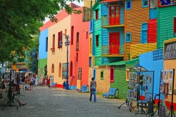
If there is one thing that everybody loves, it is colour and contrasting colours especially.
Whether it is bright colours such as these buildings, the contrasting colours in a garden or the subtle hues of a sunset scene, one might be forgiven to think that it is hard to go wrong with a splash of colour. Unfortunately, strong primary colours such as red, yellow, bright green, bright blue, etc can result in the viewer being distracted from the subject of your image, unless of course it is the subject. It is important to ensure that your subject is not lost in this way with the inclusion of colourful distractions. In the image shown here, your focus is immediately drawn to the primary colours in the front row. Most computer image manipulation programs also have tools to change colours in numerous ways, so you can create your own moods or fantasies. |
|
| If you would like to see some examples, type "color contrast photography" into Google Search and click on Images or simply click here. This provides a much wider range of images than we could show here. | |